Redesign : York Enrollment
Revamping YorkU's enrollment process!
Background: Frustrated with course selection, a friend and I redesigned the website to make it more user-friendly—all within four weeks before school started.
Roles
User Researcher
UX/UI Designer
Usability Tester
Tools
Figma
Adobe Illustrator
Team
Adrienne Luong
Cindy Yin (Me)

Solution:
The redesigned YorkU enrollment platform combines previously disconnected systems into a single, intuitive interface that is modernized to align with York’s brand guidelines. Key features like real-time updates, adjustable filters, and a linear enrollment process. This redesign reduces student stress, making enrollment faster and more efficient.

We researched the York enrollment process through a Google Form survey of students across programs and year levels, one-on-one interviews, and firsthand participation in the enrollment process. The data is biased towards second-year design students as they were the only participants we could reach at the time.
Research

Pain Points
Disorganized Course Navigation
The course selection process involves navigating multiple platforms: REM, VSB, and the Course Browser leading to frustration and confusion.
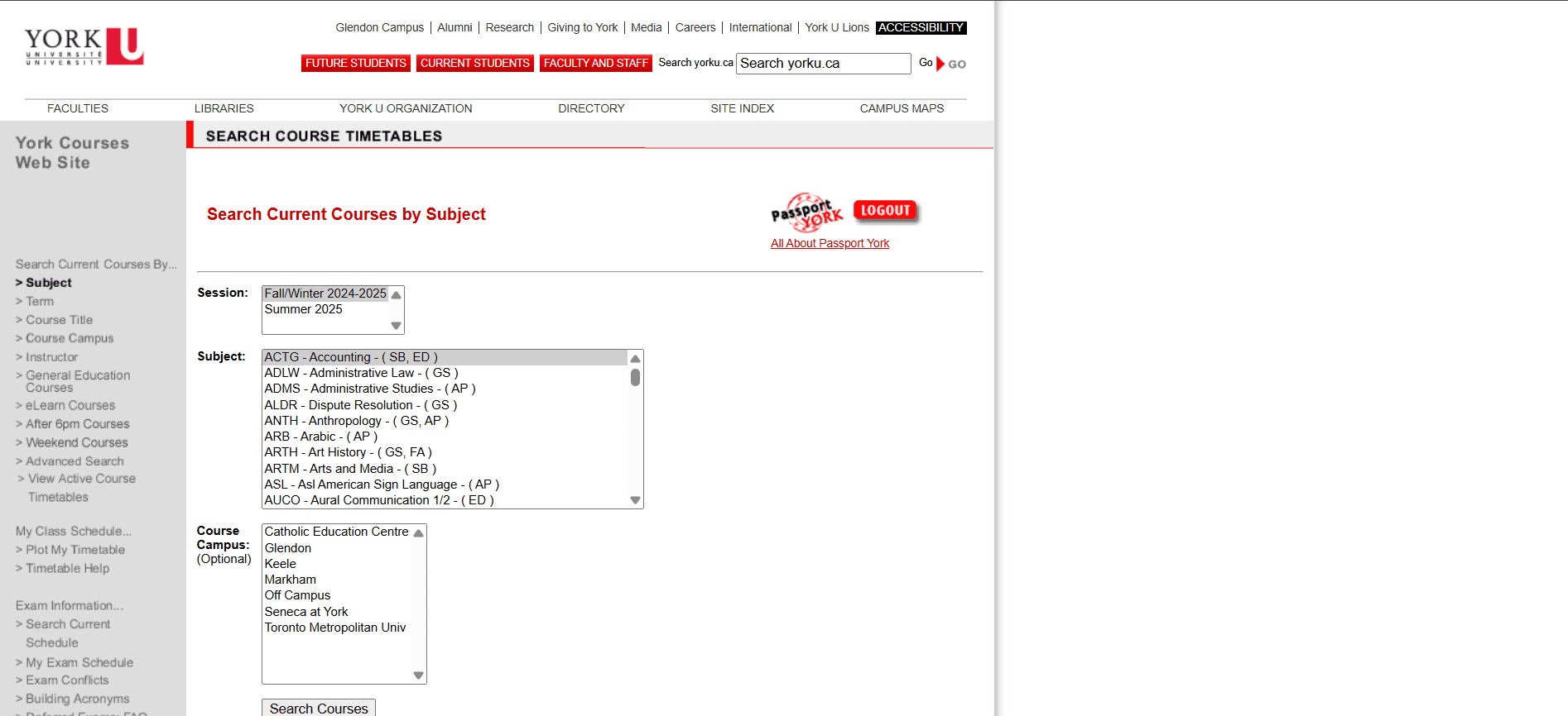
Ineffective Search Functionality
The search bar lacks relevance and filters, complicating course searches. Missing key details like prerequisites and availability drive users to external platforms like Reddit.
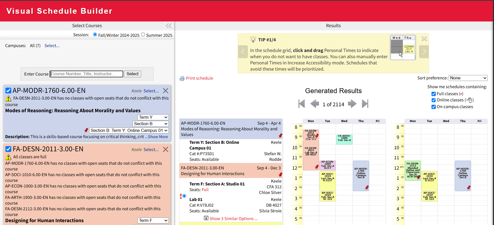
Lack of features (VSB)
Schedule conflicts make the schedule vanish without visual cues, and saving via long URLs is impractical, hindering efficient management.
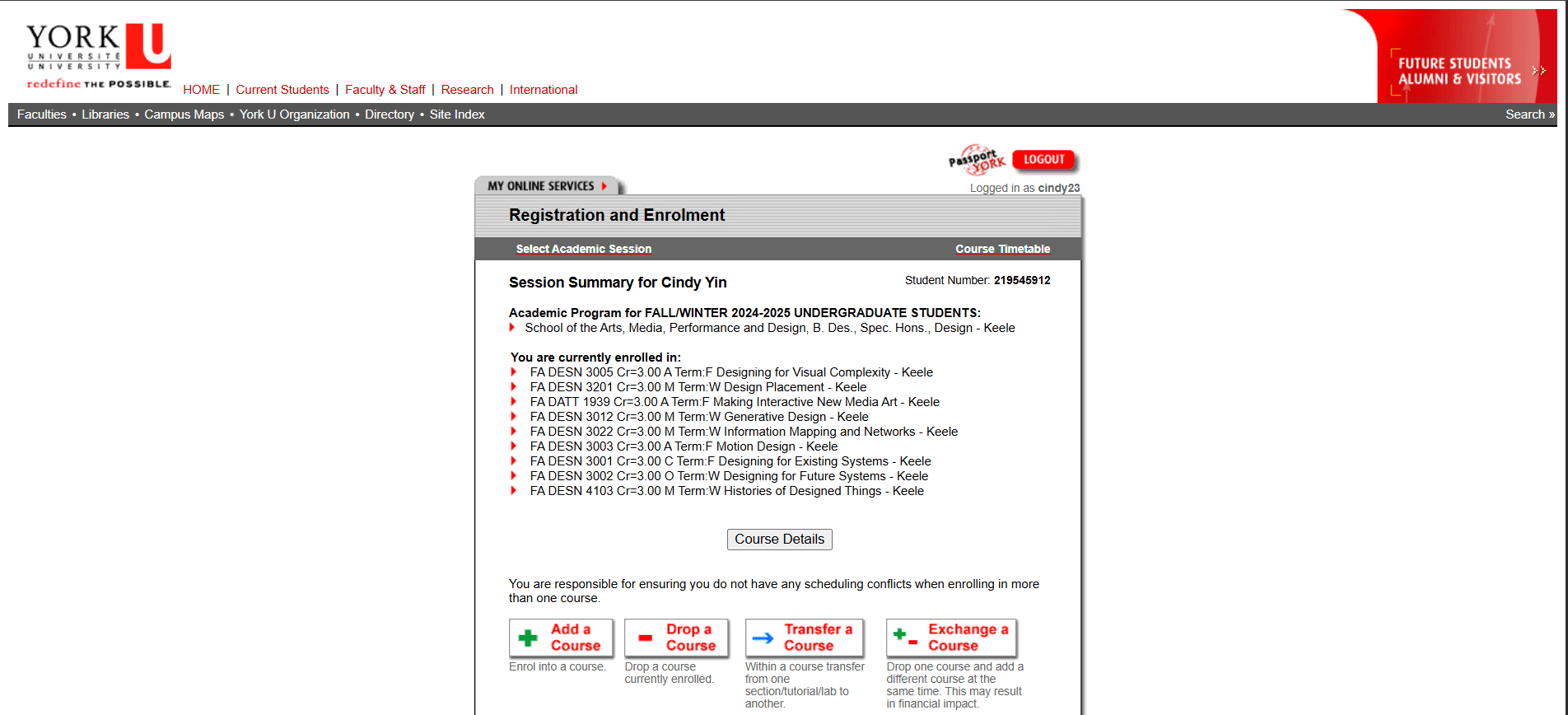
Lack of Real-Time Integration
REM is reactive instead of proactive, making enrollment needlessly stressful and inefficient


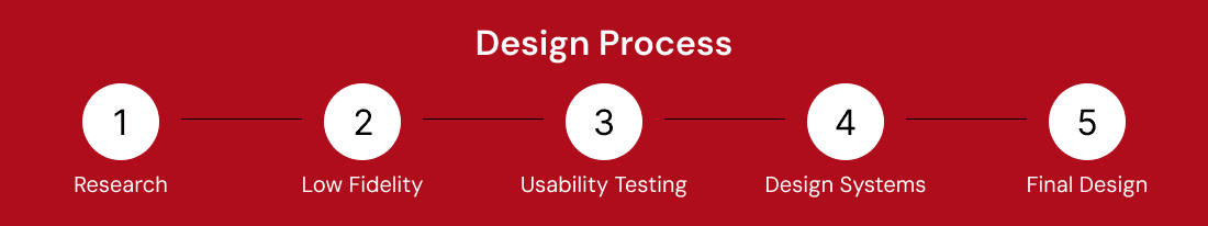
Sketches
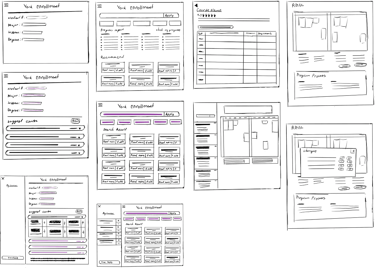
Low Fidelity

User Testing
Likes
Dislikes
Design System

# E31837
# AF0D1A
# FFFFFF
# E1DFDC
#000000